Berlin: The German Chancellery ends in a spectacular way
I know, I know, the title might be surprising, but so is the building. Sometimes, you know what to expect from a building or a city. You have a certain idea, you might have done some research before the trip. In other occasions though, the reality can take you by surprise. But that’s not necessarily wrong.
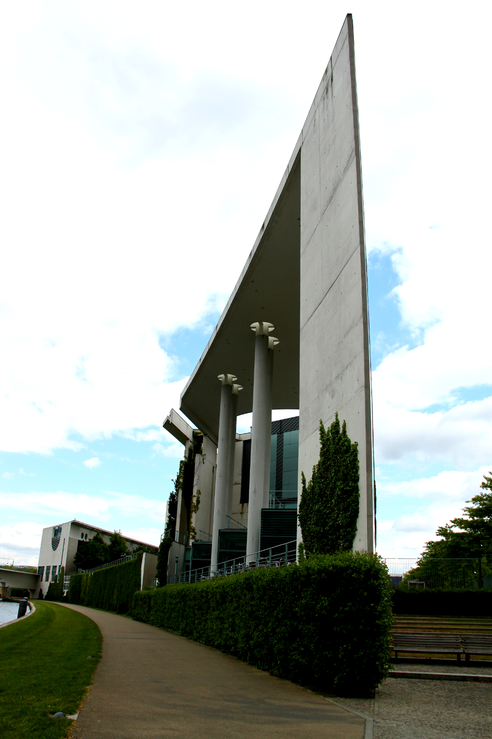
While wandering in Berlin, Andrei saw some of the famous landmarks of the city. He got to the German Chancellery (Bundeskanzleramt) and yes, he was impressed by the building. But what really baffled him was the way the building… ends.
Click on the image to view it in a larger size.

One of the sides of the building is in fact a sharp line – yes, it looks like you can cut into it. A triangle that offers an interesting perspective.
I would definitely like to know the architect’s idea/motivation for this special design! One thing is clear though: it is really a building to see. As I found out, the modern building was designed by Berlin based architects Axel Schultes and Charlotte Frank. One thing is clear: you cannot ignore this building.
The design is indeed controversial as the building is also known as „Kohllosseum (as a mix of Colosseum and former chancellor Helmut Kohl under whom it was built), Bundeswaschmaschine (federal laundry machine, because of the round-shaped windows and its cubic form), or Elefantenklo (elephant loo).” (Wikipedia)
How do you like the building? What do you think about that angle / sharp side?


Wow, interesting ending for sure! It’s picked up some interesting names as well! Thanks for sharing!